Control freak
April 15, 2019 in Screenshots by Tom
Hey everyone! We’ve been working on some small quality of life improvements for the next update. Among other things, we have an improved default control scheme, a simplified HUD, and some dynamic camera movement.
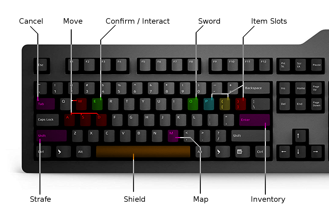
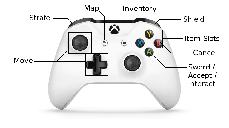
From the beginning, the control scheme has been consistently present in feedback from players. We’ve made some changes to the defaults to help keyboard and controller users feel more comfortable:
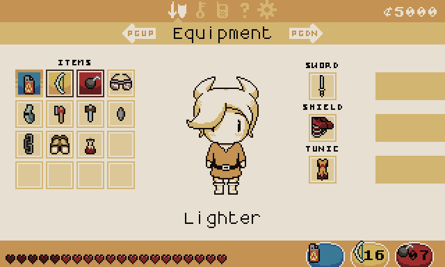
The equipment menu has been redesigned to accommodate this:
We’d like it if you’d comment with your thoughts on these controls!
The biggest change here is that there is now a pair of dedicated buttons for swords and shields. Altogether, there are now five buttons you can bind to different items. Showing all of these on the screen all the time would leave very little room for showing the world, so we took an axe to the already-chunky UI. In the end, we decided that the sword and shield didn’t need to be shown on the screen anyway, since you rarely need reminding what they’re for.
But the redesigned HUD did free up space for something I’ve wanted to add for a long time: camera movement! Since the beginning, we’ve had a fixed camera: maps are split up into rectangular screens and only one is visible at a time. The camera would only move while transitioning from one screen to the next. There are a few good reasons for doing that in a top-down action game–it ensures everything relevant to the player (doors, enemies, etc.) is visible on the screen, and nothing important is hidden by the HUD.
But in the upcoming v0.13 the camera moves in the direction you’re looking, or when you approach the edge of the screen. Check the GIF out. I spent a lot of time trying different ways of responding to the player, and different movement modes and amounts. I feel pretty confident that this makes the game look and feel more dynamic… But it can still be disabled if you don’t like it.
That’s all for now!

I really like the new camera movement and equipment redesign! Is there any ETA on next update?
And I can’t really comment on the old controls since it’s been a long while since I played, but the new ones seems okey to me.
There’s a big issue with the current control system: it’s not AZERTY-friendly at ALL.
“AWSD” is “ZQSD” in azerty
The “M” is “?” in azerty (and is instead on the position of “;” in QWERTY)
Finally, the bracket keys are “^” and “$” on AZERTY, with actual brackets being only accessible by holding CTRL+ALT
I’d personally map the inventory slots to “UIOP”, for the other stuff just make sure us poor azerty users have rebindable controls 🙂
Looking good, though!
Thanks, this is good to know! Rebindable controls are in already, and I’ll see if I can set up some defaults for non-qwerty keyboards too.